Friday, August 26, 2011

CERN experiment weighs antimatter to unprecedented precision

CERN experiment weighs antimatter to unprecedented precision
By Bryan Dyne
26 August 2011
Artist rendition of the creation of a particle
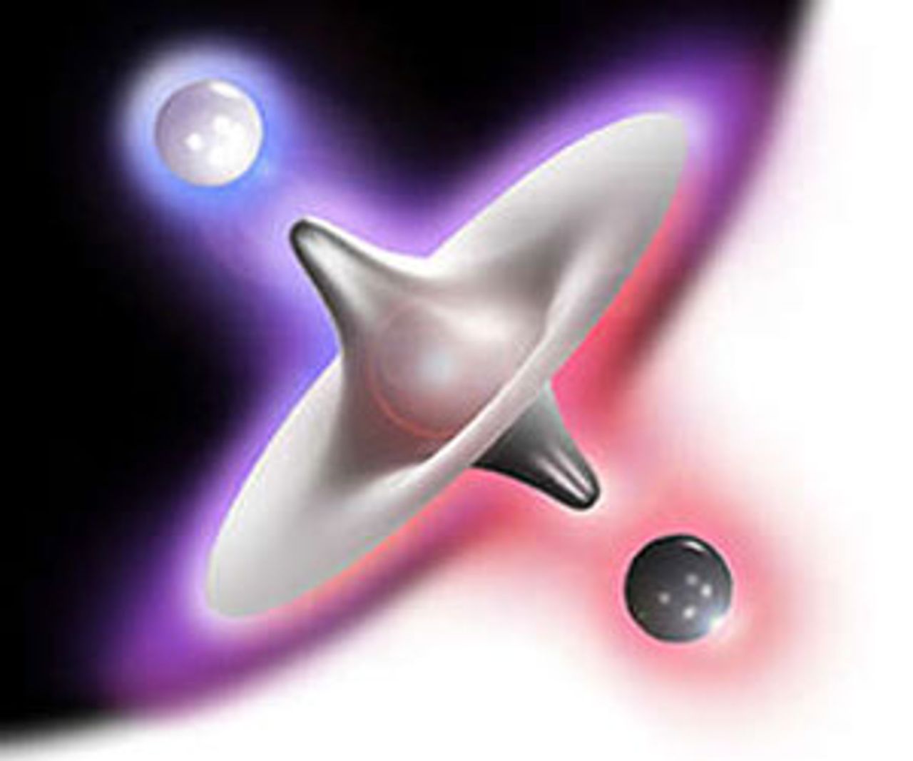
and antiparticle [Photo: CERN]
The CERN experiment ACACUSA has weighed antiprotons to an unprecedented level of accuracy. The results, published in Nature [1], do not reveal a significant difference in mass between the antiproton and its proton counterpart.
Though this answer is to be expected based on current physics, it does not help understand why matter dominates almost exclusively over anti-matter in our universe. This preponderance of matter over anti-matter is one of the main unknowns in contemporary physics.
The first three decades of the 20th century were just as tumultuous in physics as they were in politics. Experimental evidence from 1880 onward hinted that the classical understanding of physics, Newton's mechanics and Maxwell's electrodynamics, was inadequate at explaining newly discovered phenomenon, in particular the nature of light. In researching light, physicists discovered special relativity, general relativity and quantum mechanics.
By the mid-1920s, enough experimental evidence had been recorded to placate the opponents of relativity and quantum mechanics was developing into a regime that defied classical intuition. What was clearly understood, however, was that relativity and quantum mechanics must be compatible with each other for physics to remain consistent. Paul Dirac emerged as the physicist who, utilizing the works of his colleagues over the past decade, first combined special relativity and quantum mechanics [2].
Dirac's paper was a brilliant advance for understanding the universe. However, an odd result came from the equations he derived. It seemed as if something that was termed “negative” energy could exist. What is negative energy? Negative mass? Negative motion? This question spurred more research into the newly developing field and Dirac answered it three years later.
With assistance from Robert Oppenheimer, Dirac realized that instead of having negative mass, such particles would be better described as having normal mass, but with opposite charge. In addition, the “anti-particles,” when they come into contact with their normal counterparts, would annihilate, with both particles converting their mass wholly into energy.
While this solved the absurdity of negative mass, it posed a cosmological question many years later. When particles are created in accelerators, they are created in pairs, one normal matter, one antimatter. There is always a balance, a symmetry. How then does the universe exist? If antimatter and matter are created in equal parts, how did matter survive the origins of the universe? An asymmetry in the creation of matter and antimatter must exist.
Masaki Hori led the latest experiment in attempting to uncover this asymmetry between matter and antimatter. In the asymmetry, it is suspected that the mass of antimatter differs ever so slightly from normal matter. Discovering this was Hori's goal. The team started from the known mass ratio of the proton to the electron, which is 1836, and calculated the mass ratio of the antiproton and electron.
To perform such a feat, the team used a modified Helium atom. Normally, the Helium atom consists of a nucleus of two protons and two neutrons surrounded by two electrons. Hori stripped away one of the electrons and instead placed a negatively charged antiproton using CERN's antiproton decelerator. The effect of this is two-fold. First, due to the electron already around the nucleus, the antiproton will not immediately annihilate with a proton in the nucleus. This allows for two fine-tuned laser pulses to be aimed at the atom, causing the antiproton to annihilate. The information collected from these annihilations allows the mass ratio between the antiproton and electron to be calculated.
When all was said and done, the results indicated that the mass ratio of the antiproton and proton to an electron agree to ten decimal places, well within the experimental error. Differences between the charge of the antiproton and electron were also measured this way, and achieved similar results.
Though the results did not announce a breaking of the internal symmetries of physics, they did provide new constraints on the symmetry breaking that is expected to be found. In addition, the techniques developed by Mori's team allow for even more precise measurements of the mass of the antiproton. These will no doubt lead into ever more in depth searches into the nature of matter, antimatter and the mysteries surrounding both.
[1] Masaki Hori, Anna Sótér, Daniel Barna, Andreas Dax, Ryugo Hayano, Susanne Friedreich, Bertalan Juhász, Thomas Pask, Eberhard Widmann, Dezső Horváth, Luca Venturelli, Nicola Zurlo. Two-photon laser spectroscopy of antiprotonic helium and the antiproton-to-electron mass ratio .
[2] To this day, general relativity and quantum mechanics have not been merged. The search for a theory of 'quantum gravity' is an extremely active topic within the physics community.

Thursday, August 25, 2011

What Every Environmentalist Needs to Know about Capitalism

Interview: Fred Magdoff on
What Every Environmentalist Needs to Know about Capitalism

August 24, 2011

“It appears inconceivable to most of the people I spoke with that somehow there might be a future economic system that wasn’t capitalist.”

++++++++++++++++++++
[Climate & Capitalism Editor's Note:
My copy of this book arrived two days ago and I immediately read it right through.
It is an invaluable resource. Buy, share it, use it, give copies to your green friends!
It is available now from the Ecosocialist Bookstore]

++++++++++++++++++++
Interview conducted by Scott Bochert
MRzine, August 24, 2011
Fred Magdoff is co-author, with John Bellamy Foster, of the recently released What Every Environmentalist Needs to Know about Capitalism: A Citizen’s Guide to Capitalism and the Environment. He is professor emeritus of plant and soil science at the University of Vermont. Scott Borchert works for Monthly Review Press.
++++++++++++
What Every Environmentalist Needs to Know about Capitalism is a short, accessible introduction to the ecological crisis that is intended for a wide audience — why did you decide to write a book like this, and why now?
In the fall of 2008 I attended a conference where discussion of the environment was prominent, although not the only subject. As people talked about the variety of problems facing the earth and humanity I had the feeling that they were constantly “beating around the bush.” So when it was my time to talk, I discarded my notes dealing with ecology and agriculture, and said that I thought a central issue was being ignored. I explained that I was going to speak about “the bush” that I thought everyone was beating around — that is, the capitalist system and how in its very essence it is destructive of the environment.
This approach was a real stumbling block for most people there. They were very interesting and innovative people — many would be considered “out of the box” thinkers. But, I realized that they, and those in the environmental movement in general, were unable to think outside of capitalism. It appears inconceivable to most of the people I spoke with that somehow there might be a future economic system that wasn’t capitalist.
It seemed to me that this was the critical issue. I thought that, if they fully understood the role of the normal workings of the capitalist system in causing environmental havoc, people with such great concern for the environment might begin to understand that another social/economic/political system is not just possible, but essential.
Most people will agree that we’re facing a number of environmental problems, from climate change to ocean acidification to species extinction, but how serious is the situation, really?
The world’s environmental problems rise to the level of a major crisis. This is certainly the most devastating crisis that has been faced by the world’s people. There is so much damage being done to essentially all aspects of the environment that local, regional, and global ecosystems are being degraded. We are already seeing severe effects of climate change, ocean acidification, chemical pollution, soil erosion, and so on.
Just to give a few examples: extreme weather events have occurred with greater frequency; yields of a number of crops have been decreased by high temperature, droughts, and floods; the drinking water for many people is contaminated with pesticides and high nitrate levels; people have had to move because of melting permafrost in the far north and the melting of glaciers that once provided reliable water in the dry season. As the ocean level rises, low-lying coastal agricultural land is becoming contaminated with salt — this is already occurring in regions such as Vietnam’s Mekong Delta.
When all of the effects of environmental degradation are added together, the only conclusion one can come to is that the earth’s systems that support our existence as well as that of many other species are threatened. Millions of people are already suffering various effects of environmental degradation.
What are some of the proposed solutions to dealing with the ecological crisis, and why do you argue that they are insufficient?
There is no shortage of ideas about what to do — live more simply, purchase “green” products, purchase carbon credits to offset the global warming effects of an airplane trip, blast the atmosphere with particles to reflect sunlight, develop systems for taking carbon dioxide out of the atmosphere and storing it deep underground, impose a tax on all fossil fuels (a carbon tax), etc.
Some of these make more sense than others. Others have unknown consequences. However, they all give the illusion that it is possible to solve the ecological crisis without confronting capitalism as a system. And it is capitalism’s necessity to grow the economy forever and the single overriding goal of obtaining more and more profits that are at the heart of the environmental problems we face.
Why should the environmental movement be concerned with economic issues at all?
The big question — that environmentalists usually don’t ask — is why all of these assaults on the global ecosystem are happening. They are usually concerned with one issue or another, global warming, chemical pollution, soil degradation, etc. But why are they all occurring? Without digging into how the economic system actually functions in the real world (not theoretically), it isn’t possible to answer the question.
There are some environmentalists that are concerned with economic issues. In fact, there are professors who consider themselves “ecological economists,” and there is even an institute of ecological economics. But these people, some of whom are very creative thinkers, are concerned with putting a price on what they call “ecological services” — such as the role wetlands play in cleaning runoff water and providing habitat for wildlife — and suggesting ways that might make certain processes or products with less damage to the environment.
But they have no real critique of the system itself and there is no consideration given to alternative ways to organize and run an economy.
What is the general attitude of the environmentalist movement toward your view, i.e. a systemic, anti-capitalist point of view? Have attitudes been changing in recent years?
Over the last decade there are increasing numbers of environmentalists who do understand that capitalism is the critical issue. This is certainly a major step forward. However, most of these people call for what is essentially tinkering with the system — better regulations, more government support for alternatives to fossil fuel energy, trying to factor in the costs of damage done to the environment into the prices of products — while keeping the essence of capitalism intact.
Why not try to reform capitalism along “green” or “sustainable” lines, or aim for a “zero growth” economy?
Truly “green” or “sustainable capitalism” is an oxymoron. The very heart of the system — production of goods and services to make profits, which propels growth — excludes the possibility of capitalism being anything other than a system that has environmental destruction as a by-product.
Of course, it’s possible to have such things as better environmental regulations and use of fewer toxic chemicals. We now have sewage treatment plants to treat the waste of cities and the rivers are therefore cleaner.
But the need to grow — to produce and sell more and more stuff while recognizing no boundaries — and having profits as the driving force and overwhelming goal of production means the system will always be environmentally destructive.
Zero growth is an economic disaster in a capitalist economy. At this time (August 2011), the United States economy has been growing for more than two years since the official end of the Great Recession. But it’s growing too slowly to provide enough jobs to re-employ the fired workers and get anywhere near full employment.
We have some 28 million people either unemployed (14 million), underemployed, or so discouraged that they have stopped looking for work (another 14 million between them). Sustained high rates of economic growth are needed to get anywhere near what might be considered full employment.
The only way that zero economic growth can be consistent with satisfying people’s basic needs — physical and non-physical — is to have a different economic/social system in which production is done only for the purpose of providing these needs to the population instead of production for the purpose of selling stuff (regardless of its social value) and perpetually making profits.
Who are the kinds of people you hope will read this book, and what effect do you hope it will have?
Our hope is that this book will have an impact on people who already understand how serious the environmental problems are for humans as well as many other species. These people don’t need to be convinced about the environmental disaster — although there is enough information in the book to bring a deeper understanding of the issues to all who read it — but rather need to grasp how what is happening is connected to the basic way our economic system functions. It’s not an aberration — but rather a natural outcome.
You’re also the co-author of The ABCS of the Economic Crisis (with Michael D. Yates), which is a short introduction to the causes of the 2008 financial crisis and ensuing recessionwhat is the relationship between that book and this new one?
Both books are aimed at a general audience and written to be accessible to everyone interested in these subjects. Both are also in the tradition of Monthly Reviewmagazine as well as Monthly Review Press books — they try to get to the root of issues. This means putting events into context to help people understand not only what problems or issues are occurring, but, more importantly, why they occurring and what might be done about them.
How are movements and governments in other countries responding to the ecological crisis, compared to in the United States? What can people in the U.S. and other core capitalist countries do?
There is a huge amount of activity around the world over concern with, and how to improve, the environment. One indication of this concern was the 2010 World Peoples’ Conference on Climate Change and the Rights of Mother Earth held in Bolivia. Some 30,000 people attended representing many countries, organizations, and indigenous groups. Many of those attending were from organizations engaged in actions around environmental justice and stopping the pillage of the earth as well as helping people cope with the consequences. One of the people I met was from the Alaska tribal council and told of helping to move an entire native Alaska village because sea level increases and melting permafrost under their village made another location necessary.
There is much that can be done now, in the U.S. and other core capitalist countries. For example, some groups are pushing for a carbon tax with money returned on an equal per capita basis. This would slow down energy use without penalizing the poor who tend to use lower amounts of energy than the wealthy — they would receive more money than the extra they pay for the tax.
Just a few days ago people were arrested outside the White House while protesting the proposed building of a pipeline to carry oil from the tar sands of Alberta Canada to Texas. Recovery of oil from the tar sands is an especially damaging process.
There is no lack of organizations that are doing meaningful things to help the environment. What there is, however, is a lack of groups and a movement that understand that the environmental problems are deeply embedded in the economy and that a different way of interacting with the economy, other people, and the environment is necessary.

Tuesday, August 23, 2011

The Human Face of Type

The Human Face of Type

Edward Mendelson

I was always interested in typefaces, but I became obsessed with them only when my wife got pregnant. The psychological mechanism seems to have been something like this: For five centuries, printers’ type was made of lead; the form into which the molten metal was poured and which gave the letter its shape was called a matrix—the Latin word for womb. At a time when something that mattered a great deal to me was taking shape in a real womb, I could not stop thinking about letters and symbols that had taken shape in metaphoric ones.

A poster for Helvetica
For me, as for many other people who care about type, a typeface should be personal and expressive, like a human face. For others, type should be an impersonal machine for transmitting data. Each group favors different styles of type. When the documentary film Helvetica appeared a few years ago, I didn’t rush to see it, because, as someone says in the film, Helvetica is “the most neutral typeface,” the one with the least appeal to those whose feelings about type are tangled up with their feelings about people.
Now that I’ve seen the film, I’m glad I did, even though, at eighty minutes, it’s twice as long as it needs to be. Much of it presents graphic designers talking sensibly or fatuously about Helvetica, either for or against it, while the filmmakers remain too cool or dim to have views of their own. When the designers aren’t talking, the film shows pretty images of Helvetica on walls and posters and anomie-inducing music floats by on the soundtrack. But Helvetica proves unexpectedly to be a sharp comic essay about human folly. Its unspoken and apparently unintended theme is the folly of utopianism, the ancient fantasy that disorder can be tamed, that the disruptive elements of life can be suppressed, and that people can be shaped and trained into behaving as the authorities think they should. The film’s comic hero is an anti-utopian rebel who despises Helvetica for its corporate anonymity. A utopian graphic designer who seems to prefer Helvetica to human beings is its comic butt.
Anyone who used a computer in the late twentieth-century remembers Helvetica as one of the three typefaces available in almost any word-processing program and on almost any printer. The other two were Times Roman, based on the type designed by Victor Lardent for the Times of London in the 1930s, and Courier, based on the type designed by Howard Kettler for IBM typewriters in the 1950s. Helvetica was also designed in the 1950s, but some of the designers interviewed in the film seem almost surprised by the fact that it was made by human hands and not generated parthenogenetically by the simple lines and curves that shape its letter forms. Unlike the greatest type designs, which are always the work of individual artists, with their own unique genius, Helvetica was produced by two designers working together to create a neutral typeface, neither of whom (as the son of one of them says in the film) was capable of designing a typeface by himself. Still, Helvetica is so anonymous and impersonal that the thought of two human beings conceiving it over a drawing board seems faintly obscene.
As the documentary makes clear, Helvetica is the purest product of a twentieth-century utopian typographic ideology that favored modern-looking, unornamented type of the kind known as sans-serif faces, as opposed to the older designs known as serif faces. Serif typefaces—a group that includes Times, Caslon, Garamond, and others typically used in books, magazines, and newspapers, and on the screen you are reading now—have small additional strokes at the ends of the lines and curves that shape a letter or number, such as the small horizontal stroke at the foot of the letter “p” or the strokes at each end of “s.” (Historically, these additional strokes perhaps derive from traces left by a calligrapher’s pen or a stonecutter’s chisel.) Sans-serif typefaces, including Helvetica, Arial, and the typefaces used in timetables and telephone books, lack those extra strokes. No one knows the origin of the word “serif,” which seems to date back to the early nineteenth century, when sans-serif types came into common use in cheap newssheets and broadsides.
Starting in the 1920s, many European designers convinced themselves that sans-serif types were rational and modern, while serif types were bourgeois throwbacks like lace antimacassars. In 1928 the German designer Jan Tschichold championed sans-serif faces in his influential modernist manifesto, Die neue Typographie. The modern man’s vision of the world, he wrote, “is collective-total, no longer individual-specialist.” We need a “typeface expressive of our own age,” and that typeface “must be free from all personal characteristics; it will be the work of a group.” Of all the available typefaces, sans-serif, he wrote, “is the only one in spiritual accordance with our time.” In 1933 the Nazis arrested Tschichold for Communist sympathies, but he escaped and over the next few years renounced his modernist ideas: “To my astonishment I detected most shocking parallels between the teachings of Die neue Typographie and National Socialism and fascism.”

An original sketch by Jan Tschichold for Sabon, 1965
As head of design at Penguin Books during the firm’s great typographic flowering in the late 1940s Tschichold showed that traditional serif-face typography, using such classic faces as Baskerville, Bembo, Caslon, and Garamond, could be as lively and lucid as the most rational-seeming modernist designs—and far more readable. Serifs are not ornamental but functional: most of them are horizontal strokes that help to guide the eye rapidly and smoothly across the page. Sans-serif types, in contrast, present a thicket of vertical strokes that slow down the eye’s horizontal movement. Late in his career Tschichold designed a serif face named Sabon, which is sometimes cited as the most readable typeface ever made for the printed page.
Helvetica gives a lot of time to ideologues who care more about purity than about reality. Near the start of the documentary, someone says of Helvetica, “It seems to come from nowhere… . It’s this beautiful, timeless thing.” Its most passionate proponent is the Italian designer Massimo Vignelli, whose goal is to make typography as corporate and inhuman as possible. He preemptively dismisses the view expressed later in the film that a typeface derives from the individual rhythms of a person’s handwriting. “There are people that think type should be expressive,” he says. “They have a different point of view from mine.” He takes great pride in the logo he designed in Helvetica for American Airlines. One of the unintended morals of this film is that preening utopians are the natural vassals of corporate executives.

Massimo Vignelli's 1972 map of the New York subway system
With his fussy utopian snobbery, the Vignelli portrayed in this film is a great comic invention. He is the embattled Don Quixote of typography: “The life of a designer is a life of fight—fight against the ugliness.” In 1972 Vignelli designed a notorious and short-lived New York subway map that represented all the routes in abstract geometrical form, making it almost impossible for a traveler to guess the actual location of any stop. Because Vignelli’s map is true to his design principles, it is both ugly and unusable, but Vignelli’s only regret is that it wasn’t as unusable as it should have been. In the outtakes included with the DVD version of the film, he says that the map would have been better had it omitted the geographic representations of the boroughs and included only the abstract order of the subway lines.
The anti-Vignelli in the film is Erik Spiekermann, the type designer who is the film’s comic hero. Spiekermann loves typefaces as if they were human: “They are my friends.” Helvetica, he says, has none of the rhythm and contrast derived from human handwriting that makes a type readable.
The guy who designed it tried to make all the letters look the same. Hello! You know, that’s called an army. That’s not people.
Spiekermann says of his own typefaces, “They are never perfect.”
What Robert Browning wrote in his poem “Andrea Del Sarto: Called ‘The Faultless Painter,’” is more or less true of Helvetica. Andrea’s portraits are all perfect and they all look the same. Michelangelo and Raphael were less perfect painters than Andrea, but far greater. The two great geniuses of twentieth-century typography, Matthew Carter and Hermann Zapf, who both appear in Helvetica or its DVD outtakes, never designed a perfect typeface.
Carter, who began his career cutting type into metal and later drew screen fonts for Microsoft Windows, is the Leonardo of modern type, both technologically expert and with an intense clarity of artistic vision. Zapf, whose type designs derive from his spectacularly fluid and expressive calligraphy, is its Michelangelo. Carter seems incapable of saying an ungenerous word, but when he praises Helvetica he also points toward its inhuman abstraction:
It’s very hard for a designer to look at these characters and say, how would I improve them, how would I make them any different? They just seem to be exactly right. I’m glad no one ever asked me to second-guess Helvetica, because I wouldn’t know what to do.
But every great type design can be second-guessed, because it is the work of an idiosyncratic and imperfect human being. Carter’s own designs include ITC Galliard, a splendidly vigorous but notoriously imperfect typeface with an annoying italic “g” that looks like a pelican. Like all of Carter’s designs, including even his redesign of the typeface used in telephone directories, Galliard has the uneven rhythm and contrast of handwriting, and the same imperfect rhythms enliven his designs for the most readable of all computer typefaces, the serif face Georgia and the sans-serif Verdana.

Galliard Italic from the time of its introduction in 1977, in a print ad in u&lc magazine
Hermann Zapf, in the DVD outtakes from the film, says of Helvetica, “It’s a good design, no question.” But his innocent-sounding observation that the design “has a touch of the nineteenth century” demolishes Vignelli’s fantasy that Helvetica is timeless. Zapf adds that he has never used Helvetica in his typographic work—a notable omission, because, during his seventy-year career, he seems to have used almost everything else. Zapf’s own designs include Palatino, a serif face in which he reworked Italian renaissance calligraphy for use with modern technology, and Optima, a face that is technically—but not in spirit—a sans-serif, and which seems to me one of the triumphs of twentieth-century art.

A page from a specimen of the metal version of Hermann Zapf's Optima, c. 1958
Optima is the anti-Helvetica. Zapf designed it in the early 1950s, around the same time that Helvetica was taking shape, but he had a completely different and far more profound sense of what a typeface ought to be. Instead of being mathematically perfect and untethered to a particular time or place, Optima embodies a subtle understanding of history. It is nominally a sans-serif, but its lines swell subtly toward their endpoints, with the result that they suggest classical serifs without actually having them. Zapf based the letterforms on carvings he found on Italian renaissance grave stones, and their overall shape and proportions unmistakably derive from the fifteenth and sixteenth centuries. But their sleek lines suggest the aerodynamic curves of modern technology, and the whole design could only have been invented in the mid-twentieth century.
People who love type have been known to confess to each other in secret—so they can avoid being quoted in Private Eye’s Pseuds’ Corner—that in certain moods they are emotionally moved by Optima. Its echoes of renaissance carvings evoke nostalgia for a lost and unrecoverable past. Its streamlined curves evoke the forward-looking hopes of the machine age. Like other great works of art it prompts intense mixed feelings, a double sense of loss and gain: it simultaneously portrays something that has receded into the abyss of time and something that is still emerging.
Helvetica is the ideal typeface for corporate logos and any other function in which individual persons have little value of their own. Optima, in contrast, is a typeface that can be put into service to indicate the unique value of individuals. When Maya Lin designed the Vietnam Veterans Memorial in Washington, she chose Optima as the face in which the names of the dead would be etched into the polished stone wall. Every name—each signifying a particular, irreparable loss—is recorded in letters that had been designed by one person’s singular hand.
August 4, 2011 12:20 p.m.


    • and 52 others liked this.


Sharing this page …
Thanks! Close

Showing 30 comments

Sort by Subscribe by email Subscribe by RSS
  • Rorschach Test? Suspect psychologists might learn more by testing people with the same word in different typefaces. I always choose Palatino. Don't know why or what it says about me. But it must say something.
  • I am not a person possessed of deep sentiments regarding typesetting, and so I feel toward this article's dramatic aesthetic proclamations and toward the surprisingly emotional responses it has reaped a mixture of curiosity and befuddlement. However, I will say that I quite enjoyed the sly rebelliousness with which Mendelson has managed to squeeze some illicit meaning from this spectacularly vapid film. Hustwit's latest, "Objectified," is, if you can imagine such a thing, even more thought-barren than "Helvetica," bearing odious resemblance to an infomercial. I get the sense that Hustwit is so taken by his subjects that it doesn't occur to him that his film might do anything but fawn over them.
  • "Serifs are not ornamental but functional: most of them are horizontal strokes that help to guide the eye rapidly and smoothly across the page."

    You are not the first to make such an assertion, but it remains merely an assertion, unsupported (here or, so far as i know, elsewhere) by evidence.
  • I've been designing with type since 1976, and the very first brochure I did featured Optima. But as a burgeoning corporate designer, I rapidly joined the Helvetica camps (there were a few, but especially liked the Berthold setting vs the Linotype) where we were having entire annual reports set in Helvetica Ex Bold.

    By the early 80's I was reaching Helvetica-fatigue and started using the ITC type iterations, which I now abhor, with, interestingly enough, the exception of ITC Century Condensed.

    Occasionally I do come back and do an exercise with Helvetica, enjoying it's near perfection, purity, and point of view.

    As to Optima? In my view, not a classic. When you alter the fundamentals with tricks like faux serifs, for instance, you have a trendy face—fun for a while, but soon shows it's age. When I see something well set in Helvetica, I don't think "old" like I do when I see faces like Optima.

    As a designer, I choose a typeface that is well-designed, readible, and easily set (Bembo takes a little extra work to get right), but most of all for it's personality and it's ability to add that extra dimension to the printed or displayed piece.
  • I have fond memories as a young graphic design student -- decades ago -- of spending an entire day drawing a lower-case Helvetica 'a' in black and white gouche. There is a lot of beauty to Helvetica, as there is to other early modern san serif typefaces (Franklin Gothic, for example).
  • How expert a type critic can Edward Mendelson be that he reviews a film about Helvetica that came out four years ago? Sleeping on the job, indeed. I'm put off by his nasty tone, as if Helvetica were a virus sweeping the world of graphic design, demoting every print product that used it to illegible trash. Strangely, he fails to mention that Helvetica was a Swiss design, which he could have tied to Orson Welles' comment about cuckoo clocks.

    I was a typesetter for almost 30 years, a career that began with the invention of computer typesetting in the 1970s in New York City. Helvetica was then all the rage, and deservedly so. As championed by designers such as Vignelli and Stauffacher, it was the first choice for clarity and impact in advertising and graphic display. Mendelson might find Helvetica irrelevant today, but he should acknowledge the fact that it had its day and will remain one of the greats in the history of typeface design.

    If Mendelson were a shrewd observer of typefaces, he should have criticized the film "Helvetica", which I found utterly delightful, for another slip-up. At one point during a rush of logos that used Helvetica, we're shown Bloomingdale's logo. Only trouble is, Bloomie's used Avant Garde, not Helvetica.
  • A very nice article. Thank you.

    Two comments. First: The OED prefers "sanserif" to "sans-serif." It lists "sans serif" as an alternative. Second: One theory about the origin of the word "serif" is that it comes from the Dutch word "schreef," meaning stroke or line. This is the source given in the Merriam-Webster dictionaries. The OED says the origin is unknown.
  • I haven't yet been able to see the entire film, but I intend to watch it, if only because I find Mendelson's description of it so repellent. To invest differences of taste with ideological properties, and shower contempt upon people whose tastes differ from one's own, well, it sounds like something a Tea Party activist (or worse) might come up with (To the blogger who made that comparison, "Right on!") Those of us who like the streamlined elegance of modern design are inhuman, are we?! Or maybe we like a contrast between humans and our environment, a cool space uncluttered by the all-too-human complications of everyday life, where the human spirit can blossom refreshed. Or maybe it's something else -- one can think of dozens of ways to frame a preference for modernism as something other than inhuman. And manifestos about how only one way of thinking is truly human -- These have been used as pretexts for "inhuman" behavior all too many times.

    The extreme opposite of modernist sans serif would be Fraktur, and I don't know anybody who reads Fraktur with ease. It would be interesting to see some kind of corroboration of the assertion that serif typeface is easier to read quickly. Doesn't feel that way to me, and at least one respondent agrees (see above, or below). The exception is of course the capital "I"/lower-case "l" distinction, truly a problem in a sans-serif font, as another respondent has already noted (although at least one sans-serif that I use leaves a bit more space to the sides of an "l" -- I confess I haven't noticed which one, surely another sign of my inhumanity).

    So anyhow, is there any hope for any hope for those of us wicked enough to like modernism? Should programs of "self-criticism" be prescribed for us, or community service, until we're able to correct our tastes and affirm affection for the smarmy, "human", qualities of "right-thought"?
  • This comment confirms everything the original article said about utopians.
  • Rachel in California08/08/2011 12:43 AM
    It is a little sad that all the comments in this forum are in the same type face. Wouldn't it be more human if we could choose our type face?--not quite handwriting, but a bit of personal style.

    I cross platforms a lot, and the unavailability of many serif styles on other people's computers is annoying because I cannot know what the people will see when they read what I have written. I like Bookman the best, but often use Georgia or Palatino because they seem more widely available.

    I use Comic Sans for drafts. Everybody seems to have it. It has an air of nonfinality.
  • On an article about character and typography, I can't believe how many times the word "comic" appears without an accompanying "sans." According to a recent study (http://www.bbc.co.uk/news/worl..., Comic Sans is actually one of the most effective fonts for memory retention because it is harder to read.
  • I have always adored Bembo Italic ever since I found it on the letterhead of the Edinburgh Festival. Now, if my handwriting were only half as elegant.....!
  • Has anyone looked at mathematics set in Helvetica or in any other sans serif face? If you're not one of those that says that mathematics doesn't matter (except to geeks) you will see just just how clumsy it looks in Helvetica and how elegant in Times. But the film was great and a wonderful view into what designers feel about the typeface.
  • The aesthetics of the author are as nuanced as the politics of a tea party activist. Helvetica is very good and so is Optima. If I were
    capable of writing an essay on Andrea del Sarto I would use Optima (and make some remark about Scalzo being as good as anything Raphael did: silly but not necessarily wrong). For most other purposes
    I would choose Helvetica. As for Galliard I would never use it. Tahoma and Verdana (also due to Carter) are excellent, but originally only available on Microsoft products, while Helvetica was always free. As for its faintly obscene origin I would prefer a Hegelian view of an absolute font designing itself through its own absoluteness, rather than the, equally absurd, "parthogenetic" lucubration...
  • I'm not a designer. I've long loved Optima, especially the "o." But then I also like to tour old graveyards and study the gravestones— the person's history behind then, and the typography that declares the facts and sentiment of the bereaved.

    I saw the doc Helvetica a year ago and was then struck by the greed —some call it tyranny—of forcing the mission (profit, power, you name it) of rounding up the madding crowd into a faceless mass. I admit that personal antipathy was a work here; the maker of "Helvetica" as a film distributor in his bread and butter worker capaacity never paid up on a contract with which I was associated.
  • Nice article, but I'm not sure what you're talking about (which is to say: I disagree massively with your apparent derision) where the subway map is concerned.

    The approach to its design is exactly the same as that applied to all 3 such networks that I have used in my life -- the London Underground, the Paris Métro and the Metro which operates in the North-East of England -- and its function is to enable you to easily navigate the network itself. The outside world comes second and, even then, only by implication.

    I've encountered alternative maps which attempt to serve both purposes at once, accurate geographical locations and wobbly lines and all. They're extremely unhelpful when you're in a hurry, as people tend to be when navigating a major city.

    And, of course, the Underground map is a design classic.
  • Actually, people read serif faces no quicker than they read sans - it's an oft repeated fact that's simply not true.
  • captainbedworthy08/04/2011 09:36 PM
    Auriol, as it appears in F.C.Brown's Letters and Lettering, should be used in all Pubs and Cafe's.
  • Georgia is the most readable digital typeface? Whaaa?
    Bite your tongue sir, bite it I say.
  • Oh dear. Name a better typeface designed specifically to read in a browser that is available on pretty much every computer (both Windows and Mac) and I'll bit MY tongue!
  • Great article - thank you very much!

    In my job I had to read a lot, and when laser printers came up and many people thought that they had to use Helvetica because it was "modern" I hated that: As has been stated often enough since, most people read serif type noticeably faster.

    One thing which annoys me is that in Helvetica the lower-case l looks exactly like the upper-case I. In German where the first letter of all nouns is a capital letter this can be confusing, especially with unfamiliar nouns or names. In Optima there is a subtle difference between the I and the l; some sans-serif typefaces add a small tail to the lower-case l. But serif is best for long texts!
  • "As has been stated often enough since, most people read serif type noticeably faster."

    This is not the case.

    The best available studies show that people read fastest what they read most. Both serif and sans serif fonts are now common enough that accuracy and speed are comparable with either style.
  • Anthony Acock08/04/2011 04:50 PM
    Great article, very informative, however – I vehemently disagree with your assertion that helvetica is boring, and unhuman. It is a stunning, elegant, and versatile type face.
  • An 80-minute documentary shouldn't be taken as the last word on typography.
    Some questions and notes prompted by this enthusiastic article, which needs to be praised for drawing your readers' attention to a fascinating and subject. One can't think of another similar piece in recent years, with the exception of the informative colophons of Alfred A. Knopf books ("This book was set in a typeface called Bulmer. This distinguished letter is a replica of a type long famous...")
    *Didn't Stanley Morison and/or William Starling Burgess design Times New Roman? Victor Lardent was an illustrator for The Times who finalized their design. *The notorious Eric Gill designed Sans Serif. Max Miedinger and Eduard Hoffman designed Helvetica.*Optima was the typeface of the 2008 John McCain campaign.*While nobody knows for sure where the word serif came from, Merriam-Webster's Second Edition suggests it may have come from the Dutch word schreef -- a fine line.
  • Thanks to the extended typographical note in the back pages of books published by Liberty Fund, I had long thought the distinguished Stanley Morison (who also edited The Times Literary Supplement 1945-1948, when Alan Pryce-Jones suceeded him) was designer of record of Times New Roman as well, but see in the Wikipedia entries for him and for Victor Lardent, and in pages to which they link, that the typeface may have been more a collaboration.
  • I enjoyed this fine article. Took me back to my first studies of typeface as a Library science student studying history of the book. The bug bit me then and I enjoy looking at typefaces everywhere. As a writer, I choose my typefaces with care. Thanks.
  • Giorgetta McRee08/04/2011 03:17 PM
    Excellent! Love this article.
  • How delightful to read someone who understand the expressive potential--or lack thereof--of typefaces!

    I have always associated the word "serif" with Latin origins for seraphim; hence I see serifs on fonts as little wings. A highly subjective interpretation, I'm
    sure.

    BTW, the most expressive feature of Optima is the thick-thin parts of each letter, which of course come from Zapf's calligraphy. No wonder Helvetica and other modern fonts that lack that feature are so boring.
  • Good posture isn't boring, it is static.
  • I think you've got it Rose. I've often heard the same lore about serif meaning angel wings. Nice to see an article about such an overlooked, yet significant component of communication.